Responsive design found life when Cameron Adams posted the 2004 blog entry, Resolution Dependent Layout, which describes how his frustration with the most common screen resolution of the time (800 x 600), ended with the first ever responsive webpage. See the webpage here.1
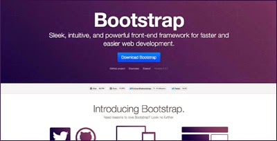
In 2012, Mark Otto, the creator of Bootstrap, stated there were over 750,000 Bootstrap downloads in a four month period.2
By 2013, smartphones were owned by 56% of American adults,3 and 2014 was the year mobile users surpassed desktop users.4
Responsive design has even touched my own career. For the past 2 years I have taught responsive web at the Academy of Art University and each company I've worked for, since 2011, has requested a responsive solutions.
What does all of this mean? Responsive design has surpassed a fad and has moved into standard practice, but with so many ways to accomplish the same technique it's easy to implement the wrong solution. Here is what I find works the best:
-
Use a framework – Because responsive design has been around since 2004, there are many excellent frameworks to select from. Here are the three major frameworks and a comparison of them:
-
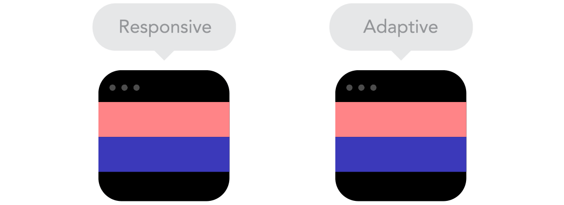
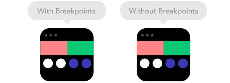
Understand the fluid grid – In the past, a fixed grids would adapt by changing the pixel size at four specific screen resolutions. Today, the fluid grid uses percentages instead of pixels to handle all device resolutions instead of just the four.
-
Consider mobile-first design – Mobile-first design includes touch gestures (no hovering on mobile), size constraints, and common device holding patterns for navigation placement. Mobile apps are a great example of mobile-first design because they were made for smaller screen resolutions.
-
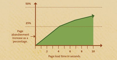
Know every second counts – Loading time is a leading factor of webpage abandonment. While most mobile users will wait 6-10 seconds before abandonment, "a one second delay in page response can result in a 7% reduction in conversions. If an e-commerce site is making $100,000 per day, a 1 second page delay could potentially cost them $2.5 million in lost sales every year".5
-
Finalize the design with CSS media queries – Well written styles inside a media query can improve a responsive design and make a site ‘pixel-perfect’ at every resolution. After implementing a framework use media queries "to change styles based on the characteristics of the device rendering the content".6
-
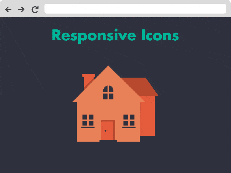
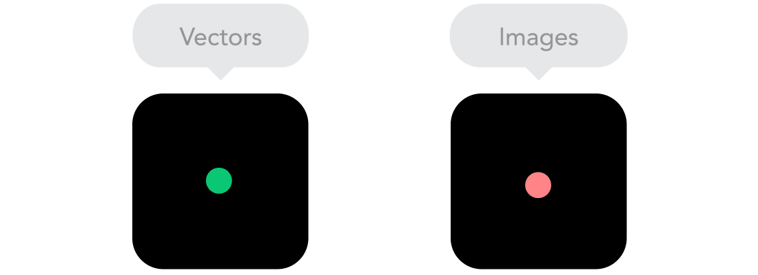
Stay lossless with vector icons – An image that does not pixelate at larger resolutions can cost a significant amount of data space, slowing down load times. The solution: Vector graphics. Vectors use geometrical primitives based in mathematical expressions to represent images,7 which mean they do not degrade at any level and are typically smaller files. Vector-based icons can even be converted into a webfont.
-
Face the font – With the CSS3 @fontface and improved cross-browser standards, it is easier than ever to bring magazine style design and typography to life in any browser or screen resolution.
-
Understand the audience –
- Who is the audience? Create user personas.
- What will the website do for the audience? Decide if it will sale products, generate leads, or establish credentials.
- Where will the audience access the website from? Find out if the site will be used frequently on mobile, desktop, or both.
- When will the audience complete their goal? Develop user flows.
- Why should the audience return in the future? Optimize the site to be sticky.
- How does the audience find what they are looking for? Know the four modes and how to design for them.
-
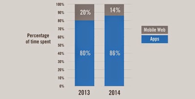
Try PhoneGap – In 2014, roughly 85% of mobile time was spent within an application instead of on the web,8 so there may be a desire to develop an application for the iPhone, Android, or Windows Phone. Fortunately, native code is no longer the only option; frameworks like PhoneGap allow developers to easily create apps using the web technologies they know and love: HTML, CSS, and JavaScript.9
-
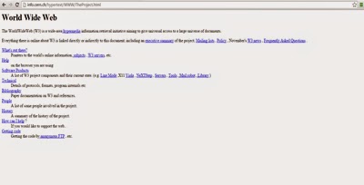
Be progressive – Evolution is not only required, it's inevitable. The very first website launched August 6, 1991. It was made up of text, links, and anchors. See the website here. And today, we are developing solutions for watches. As a designer or developer progresses in their abilities, it would serve them well to look back at past works and realize just how much they have improved.
Typical desktop view
Typical mobile view
Mobile-first designed mobile view

/* ----------- Non-Retina Screens ----------- */
@media screen
and (min-device-width: 1200px)
and (max-device-width: 1600px)
and (-webkit-min-device-pixel-ratio: 1) {
}
/* ----------- Retina Screens ----------- */
@media screen
and (min-device-width: 1200px)
and (max-device-width: 1600px)
and (-webkit-min-device-pixel-ratio: 2)
and (min-resolution: 192dpi) {
}
@media screen
and (min-device-width: 1200px)
and (max-device-width: 1600px)
and (-webkit-min-device-pixel-ratio: 1) {
}
/* ----------- Retina Screens ----------- */
@media screen
and (min-device-width: 1200px)
and (max-device-width: 1600px)
and (-webkit-min-device-pixel-ratio: 2)
and (min-resolution: 192dpi) {
}
@font-face {
font-family: "Segoe UI Light";
src: url("SegoeUI-Light.eot");
src: local("☺"),
url("SegoeUI-Light.woff") format("woff"),
url("SegoeUI-Light.ttf") format("truetype"),
url("SegoeUI-Light.svg#SegoeUI-Light") format("svg");
}
font-family: "Segoe UI Light";
src: url("SegoeUI-Light.eot");
src: local("☺"),
url("SegoeUI-Light.woff") format("woff"),
url("SegoeUI-Light.ttf") format("truetype"),
url("SegoeUI-Light.svg#SegoeUI-Light") format("svg");
}
References
1. Adams, Cameron (September 21, 2004). "Resolution dependent layout: Varying layout according to browser width". The Man in Blue.
2. http://www.quora.com/How-many-people-are-using-Twitter-Bootstrap
3. Smith, Aaron (June 5, 2013). "Smartphone Ownership 2013". Pew Research Center.
4. Bosomworth, Danyl (January 15, 2015). "Mobile Marketing Statistics 2015: Statistics on mobile usage and adoption to inform your mobile marketing strategy". Smart Insights.
5. https://blog.kissmetrics.com/loading-time
6. https://developers.google.com/web/fundamentals/layouts/rwd-fundamentals/use-media-queries
7. http://en.wikipedia.org/wiki/Vector_graphics
8. Edwards, Jim (April 7, 2014). "Mobile Apps Are Killing The Free Web, Handing A Censored Duopoly to Google And Apple". Business Insider.
9. http://phonegap.com/